The Report Data Model is the backbone of every Omniscope report.
It defines what data your report sees and how that data behaves — from which sources it pulls, to how fields are formatted, grouped, or made interactive.
If you’ve ever wondered how reports connect to data, or how dynamic grouping and measure choices actually work — this is the place to start.
What Is the Report Data Model?
When you open a Report in Omniscope, you’re not just looking at charts. Behind the scenes, there’s a data model that powers everything — think of it as a small, self-contained data layer that lives inside your report.
The Report Data Model determines:
Which datasets (sources) the report uses
How those datasets are combined or transformed
Which variables and formulas control user interactivity
How fields are formatted and presented
What hierarchies, groupings, and measures are available
It’s like a mini workflow built just for your report — but focused on shaping and presenting the data, not processing it.
A key element to build dynamic and powerful reports
The Data Model gives you a lot of flexibility. You can:
Create multiple reports from the same workflow outputs, each with its own tailored data setup.
Let viewers switch between measures or dimensions (without editing the report).
Keep visualisations clean by formatting and hiding fields right where they’re used.
Standardise how your organisation defines and calculates key metrics.
Without it, you’d have to bake all of that logic into the workflow — and your reports would be much less interactive.
The Building Blocks
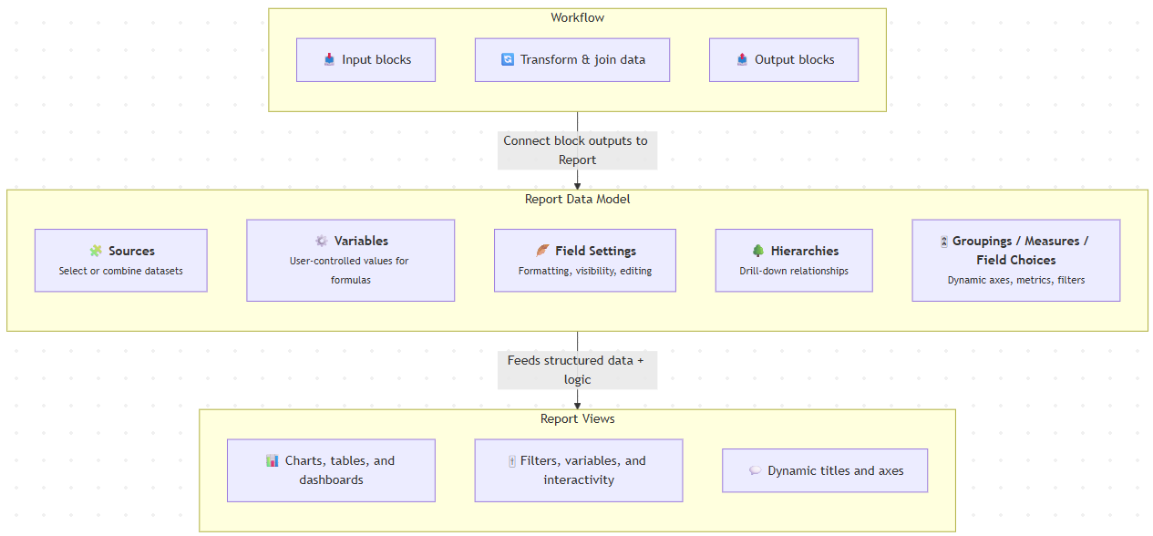
Here’s a quick tour of the main parts of the Report Data Model.
1. Sources
This is where it all begins.
In the Sources tab, you choose which datasets your report uses.
These can come directly from workflow outputs (blocks connected to the Report), or you can define derived sources inside the Data Model itself — by joining, filtering, or transforming existing data.
You can think of this as a lightweight “mini ETL” inside your report.
? See also: Joining multiple report data sources dynamically
2. Variables
Variables let you make reports interactive and context-aware.
They can drive formulas, filters, measure or field selections — basically any place where you want a user’s choice to affect what’s displayed.
For example, a user could pick “Sales” or “Profit” from a dropdown, and all charts update accordingly.
? Learn more: Variables application – enable report recipient to pick split/measure field
3. Field Settings
The Field Settings area lets you define how each field behaves and looks:
Data type (number, date, text)
Display format (e.g. currency, decimal places)
Shapes and colours
Field order
Whether users can edit or view it
Custom labels or descriptions
This is where you turn your data into something readable, consistent, and polished.
4. Hierarchies
Hierarchies define drill-down paths such as Country → Region → City, allowing users to explore data at different levels of detail in pivot tables or visualisations.
It’s a great way to make your reports feel interactive and intuitive without extra setup.
5. Groupings, Measures, and Field Choices
This is where things get clever.
Named Groupings, Measures, and Field Choices let you create dynamic reports — where the same visual can display different metrics or dimensions depending on user selection.
Examples:
A dropdown that switches between grouping “by Product” or “by Region”
A toggle that changes the measure from “Revenue” to “Profit”
Dynamic axis titles that reflect the current choice
It’s a great way to give users control without duplicating charts.
? Learn more: Grouping, Measure, and Field Choices – Dynamic axis titles
How It All Fits Together
Here’s a typical setup workflow:
Connect your workflow output to a Report block.
Open the Report → click Data Model.
In Sources, select or build the datasets you need.
Add Variables to make user-driven logic possible.
Use Field Settings to tidy up formats, names, and visibility.
Define Hierarchies for drill-down exploration.
Create Groupings, Measures, and Field Choices for interactivity.
Build your visuals using those named elements.
Test it in viewer mode to make sure everything responds as intended.
Best Practices
Keep complex transformations in the workflow; use the Data Model for lightweight shaping and interactivity.
Expose only the fields and sources users actually need.
Use Variables and Field Choices to make reports flexible instead of duplicating charts.
Standardise your Groupings and Measures across reports for consistent metrics.
Document your Data Model if multiple people maintain the report.
Learn More
Administrator Tip
For admins and power users:
The Data Model defines exactly what report viewers can see and query (via the Query API).
Restrict access to reports that include sensitive data, or expose only pre-aggregated sources.
Consider creating a template report with a standardised Data Model (sources, measures, field formats) for your teams to reuse — it keeps things consistent and reduces setup time.
Was this article helpful?
That’s Great!
Thank you for your feedback
Sorry! We couldn't be helpful
Thank you for your feedback
Feedback sent
We appreciate your effort and will try to fix the article