Omniscope branding functionality allows you to create your own styling and add logos to the application, including reports and file/project list pages.
Branding follows the same principle as Server permissioning in regards to how they are applied and configured. For example, just like you can set permission a particular folder, you can also configure branding, on a per-folder basis. If you have multiple clients you can create a folder for each client, with each folder having their own branding. If a folder does not have a branding configured, then it will inherit branding from the parent folder.
The configure branding go to Admin Web app, which is accessible via the “Admin” link, in the footer of the File list page, and choose Branding/Permissions link.
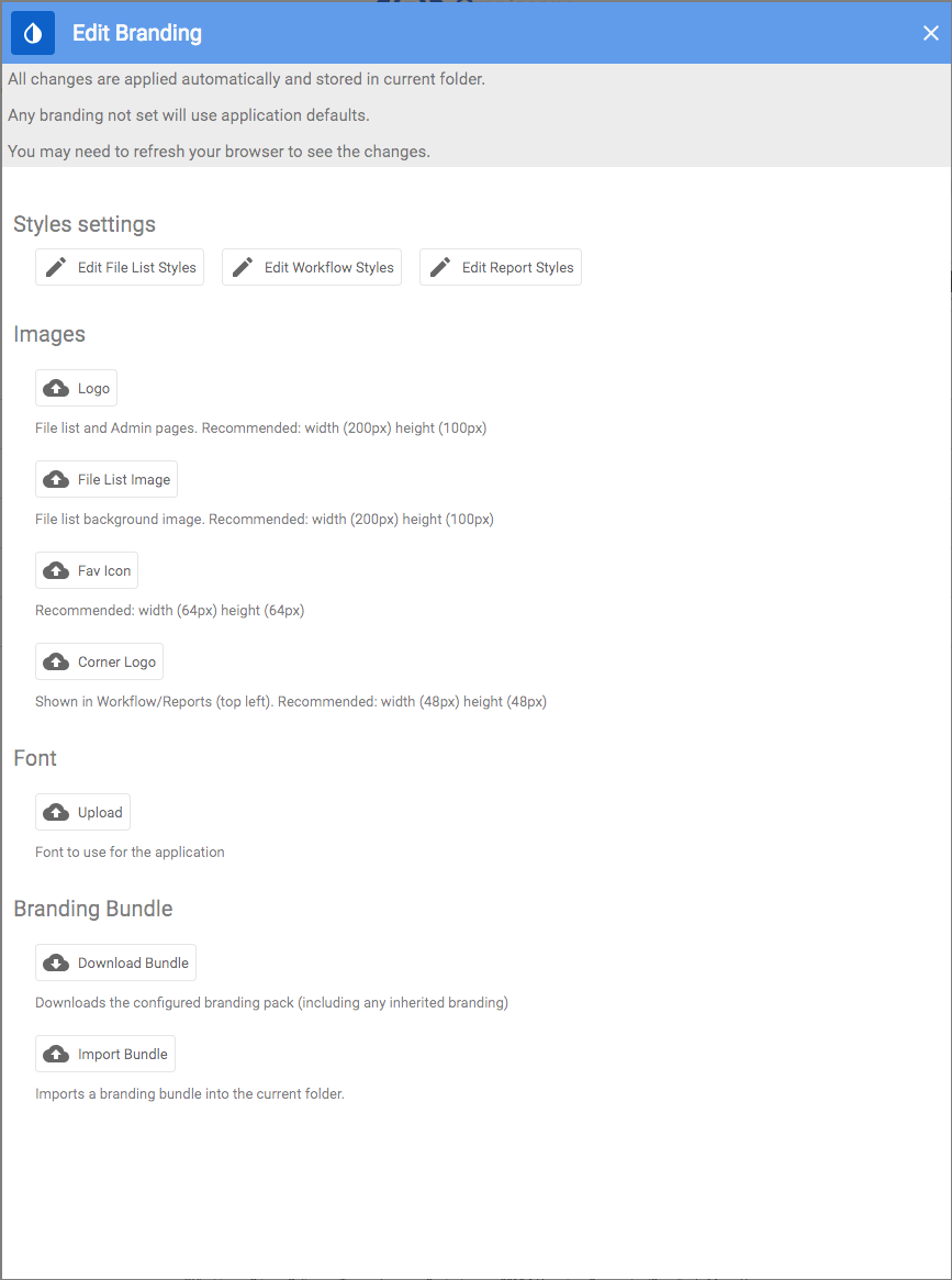
To configure a particular branding click on “Edit branding” in the top right hand corner.
You will then be able to configure styles and upload images. Branding settings also allow you to configure defaults for the “Reports” (available in the Report styles), which can be further customised on a per-report basis. Edit branding dialog also allows you to import / export 'branding bundle', making it easier to apply already configured branding of another folder to the current folder.
Report
Reports take their default branding the first time they are opened from a folder. You can override folder branding on a per-report basis from the Report settings dialog.
NOTE: When you share your IOR you have an option to embed your branding into the reports. When the user opens your report it will automatically pick up all your configured branding.

Report font
The setting enables you to allow the current report to use a Google font. All you need to do is to type in the exact name of the font you've found on the Google's font page. If you don't like the result, you can revert the changes.
Toolbar
This section allows you to configure various toolbars.
- Text
Change colour of the text that appears on the toolbar. These are normally breadcrumb content text and barometer values. - Background
Controls the background of the toolbar. - Corner logo background colour
Controls the background colour of the mage shown in the top left hand corner of the report.
- Button icon/text
Controls the colour of icons/text of the buttons that appear on the toolbar such as "add view" button. - Selected button icon/text and background
Controls any selected buttons that appear on the toolbar i.e. "Present" button or "Save" button. - Barometer colour
Controls the colour of a barometer on the main toolbar.
Dialog toolbars/button
Allows you to configure dialog toolbars and buttons that appear.

Styling of the charts
Each visualisation chart bundled with the application provides a set of styling options, some of which may be specific to this chart, or shared among the multiple views.
Was this article helpful?
That’s Great!
Thank you for your feedback
Sorry! We couldn't be helpful
Thank you for your feedback
Feedback sent
We appreciate your effort and will try to fix the article